this post was submitted on 23 Jul 2024
1 points (100.0% liked)

Technology

59651 readers
2643 users here now

This is a most excellent place for technology news and articles.


Our Rules


  1. Follow the lemmy.world rules.
  2. Only tech related content.
  3. Be excellent to each another!
  4. Mod approved content bots can post up to 10 articles per day.
  5. Threads asking for personal tech support may be deleted.
  6. Politics threads may be removed.
  7. No memes allowed as posts, OK to post as comments.
  8. Only approved bots from the list below, to ask if your bot can be added please contact us.
  9. Check for duplicates before posting, duplicates may be removed

Approved Bots


founded 1 year ago
MODERATORS
 

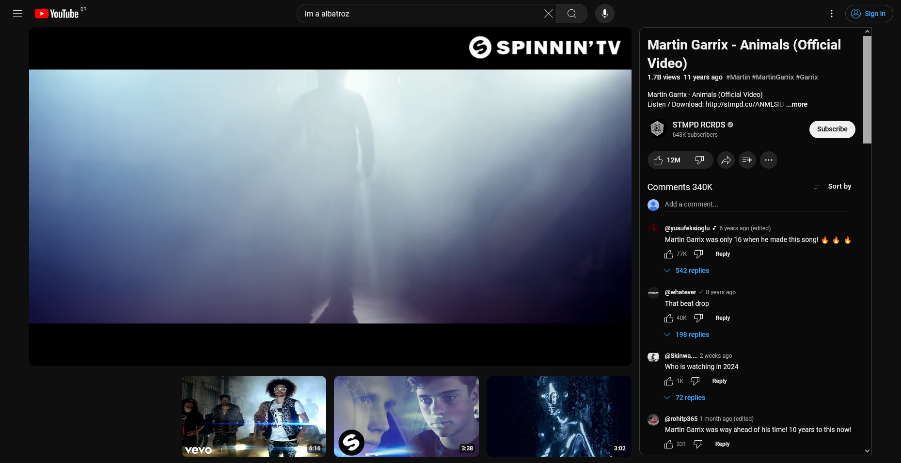
Hey, I was browsing youtube in private mode, and out of nowhere it started looking like this, I really hope this doesn't go through lolol...

(the black square bottom right is probably an ad being blocked.

all 42 comments
sorted by: hot top controversial new old
[–] jimmydoreisalefty@lemmy.world 0 points 4 months ago (1 children)

They are always testing changes to different groups of people.

Not too sure how that works, but if you wnat the old layout you can add extensions.

Quick search results in:

How to Undo YouTube's Terrible New Layout [Jake Peterson | May 23 2024 | LifeHacker] https://lifehacker.com/tech/how-to-undo-youtubes-terrible-new-layout

How to Get Old YouTube Layout Back: Simple Steps for Nostalgic Navigation [July 18, 2024 | bytebitebit] https://bytebitebit.com/tips-tricks/how-to-get-old-youtube-layout-back/
[–] Schal330@lemmy.world 0 points 4 months ago (1 children)

It's likely A/B Testing and when people receive the new layout, if Youtube sees a drop in engagement for their experiment they may just ditch it.

[–] jimmydoreisalefty@lemmy.world 0 points 4 months ago* (last edited 4 months ago)

Oh, thanks for the link!


Edit: added a bit of information below for those interested

A/B testing (also known as split testing or bucket testing) is a methodology for comparing two versions of a webpage or app against each other to determine which one performs better. A/B testing is essentially an experiment where two or more variants of a page are shown to users at random, and statistical analysis is used to determine which variation performs better for a given conversion goal

In an A/B test, you take a webpage or app screen and modify it to create a second version of the same page. This change can be as simple as a single headline, button or be a complete redesign of the page. Then, half of your traffic is shown the original version of the page (known as control or A) and half are shown the modified version of the page (the variation or B).

The following is an A/B testing framework you can use to start running tests:

  1. Collect data:
  2. Identify goals:
  3. Generate test hypothesis:
  4. Create different variations:
  5. Run experiment:
  6. Wait for the test results:
  7. Analyze results:
[–] recklessengagement@lemmy.world 0 points 4 months ago (3 children)

I've been getting very close to ditching YouTube. This change showed up a few weeks ago for me and pushed me a bit further.

If they succeed in inserting ads into the video stream I'll bail alltogether. I can fit a subscription to Brilliant, Dropout, and several creator Patreons into the cost of a YouTube Red subscription, and I won't have to deal with these attention-optimizing UI changes.

[–] melroy@kbin.melroy.org 0 points 4 months ago (1 children)

I'm also very close in ditching all Google products. Including search.

[–] pyre@lemmy.world 0 points 4 months ago (1 children)

i haven't used their search in ages. ddg is good enough and doesn't flood you with ads instead of actual results. still not as good as Google used to be once upon a time, but I'll take 80-90% quality over the garbage that is Google search.

but I'm also considering switching to kagi

[–] melroy@kbin.melroy.org 0 points 4 months ago

DuckDuckGo is a meta-search engine and is mainly depended on results from Bing and Yahoo! actually.

[–] fionnafire@lemmy.blahaj.zone 0 points 4 months ago (1 children)

You can get YouTube premium for like three bucks if you VPN into certain countries. Ukraine worked for me.

[–] Caligvla@lemmy.dbzer0.com 0 points 4 months ago (1 children)

Yes, let's abuse a country's poor economy so the service providers eventually raise the price in the region as a direct countermeasure and fuck over the real citizens that needed that cheaper regional pricing.

[–] fionnafire@lemmy.blahaj.zone 0 points 4 months ago (2 children)

That's a good point but you don't have to be an asshole about it

[–] Caligvla@lemmy.dbzer0.com 0 points 4 months ago

I'm sorry for my previous tone, it's just that this subject makes me irrationally angry and I acted without forethought. In retrospect I shouldn't have written what I did, I apologize, have a nice day.

[–] richieadler@lemmy.myserv.one 0 points 4 months ago

I think he was very polite, considering.

[–] Orfeluh@lemmy.world 0 points 4 months ago

You can use some of the alternatives like Piped in web browser or desktop app called FreeTube

[–] magic_smoke@links.hackliberty.org 0 points 4 months ago (1 children)

People still use the official site?

[–] admin@lemmy.my-box.dev 0 points 4 months ago (1 children)

^ Mocks people for using the default, then proceeds to not give alternatives they deem better.

[–] RobotZap10000@feddit.nl 0 points 4 months ago (1 children)

Invidous takes all of the crap out, but the video quality may be sometimes subpar. Find your nearest instance or spin up your own! I'd also recommend using a redirect extension in your browser for a seamless experience.

[–] Sidyctism2@discuss.tchncs.de 0 points 4 months ago (1 children)

Newpipe for android users is pretty dope.

Also yt-dlp for a CLI program if you're into that.

[–] helpImTrappedOnline@lemmy.world 0 points 4 months ago* (last edited 4 months ago) (2 children)

That looks pretty awful IMO. So much wasted space with the bottom thumbnails.

Extension suggestion: Enhancer for YouTube

https://addons.mozilla.org/en-US/firefox/addon/enhancer-for-youtube/

To keep it self working it prevents "expiramental layouts" from youtube.

Great for setting YouTube player defaults the way you want.

[–] LodeMike@lemmy.today 0 points 4 months ago

It is auful. There's uBlock rules to disable it.

[–] Lost_My_Mind@lemmy.world 0 points 4 months ago (2 children)

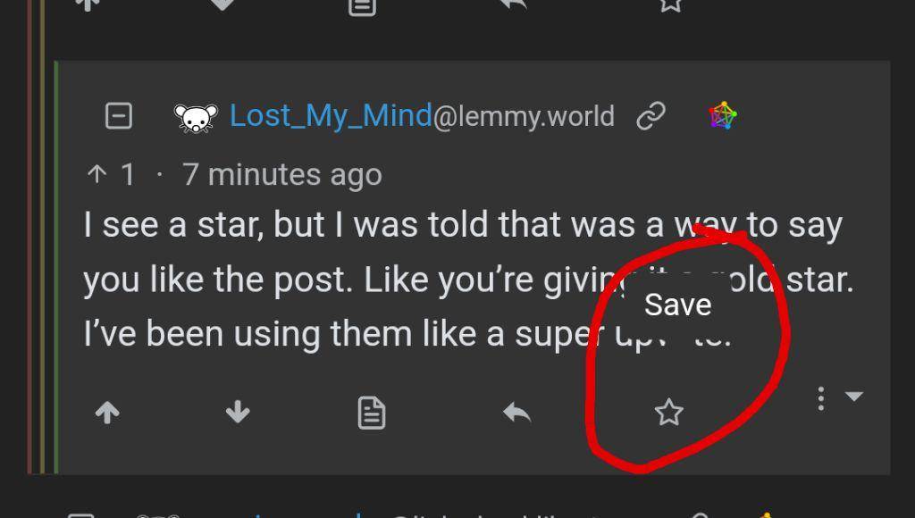
Commenting here so I can come back to this when I get home, as Lemmy doesn't have a save option.

[–] Interstellar_1@lemmy.blahaj.zone 0 points 4 months ago

Lemmy absolutely does have a save option

[–] jimmydoreisalefty@lemmy.world 0 points 4 months ago (1 children)

You don't see a star or bookmark symbol on comments?

Might be app you are using?

[–] Lost_My_Mind@lemmy.world 0 points 4 months ago (2 children)

I see a star, but I was told that was a way to say you like the post. Like you're giving it a gold star. I've been using them like a super upvote.

[–] Rolando@lemmy.world 0 points 4 months ago

To do a super upvote you can give Lemmy gold.

[–] 01189998819991197253@infosec.pub 0 points 4 months ago* (last edited 4 months ago)

Long press the star, and it says Save. Not entirely sure where the saved posts go, though.

Edit: found it. Go to your profile, then the Saved tab.

[–] tb_@lemmy.world 0 points 4 months ago

I'm not a fan. I prefer watching in theatre mode; when opening comments it closes theatre mode.

[–] mihnt@lemmy.ca 0 points 4 months ago (2 children)

Does anyone know of a way to sync channel and have it auto-download to my server for watching how I want to?

[–] olicvb@lemmy.ca 0 points 4 months ago

aughta have a better way somewhere, but until you find it you could set a batch file to run youtube-dlp twice a day.

I found this comment on reddit with an example of how you can have it check to make sure you don't download the ones you already did.

[–] dev_null@lemmy.ml 0 points 4 months ago

I don't see the black square bottom right? There is one bottom left.

[–] geography082@lemm.ee 0 points 4 months ago

My layout didn’t change… maybe because I use my piped :D

[–] 001Guy001@lemm.ee 0 points 4 months ago

Some ways to try to revert it (some have already been mentioned)

👉 Go to this page and check if you're able to opt out of the "Redesigned Watch Page" (source)

👉 Install a userscript addon like Violentmonkey, and then use a script like Classic Youtube Layout (which is based on this script which was outdated in regards to the related videos sidebar)

  • If you get an error about the @match line of the script then click on allow edits and change it from *.youtube.com/* to *://*.youtube.com/*, or install the script as it is and then put *://*.youtube.com/* in the "@match rules" line in the settings tab of the script
  • There's also this script that you would need to add its code manually to the userscript addon by clicking on the new script icon (see the author's post for more details)

👉 Use uBlock Origin filters like these or these

  • Note that youtube.com##+js(set, yt.config_.EXPERIMENT_FLAGS.kevlar_watch_grid, false) should be enough to change the UI back for the most part

👉 Use this userscript and Stylus style

👉 The addon Enhancer for YouTube (Firefox / Chrome) also reverts the UI, at least partially

👉 (might only work some times) Use the addon CustomTube - Firefox / Chrome (the default UI is from 2017 but you can choose 2021 in the settings. It's not exactly like the one from 2023 but it's close enough)

  • note that it removes some buttons like Join by default so go over the settings if relevant

If you also want to change the number of videos per row in the subscription page and channels' videos page, then you can add this uBlock Origin code to the "My filters" tab (at the end click "Apply changes", or Ctrl+S) (this is for 6 items per row but you can change the number in the first 2 line as needed) (source 1 / source 2)

youtube.com##ytd-rich-grid-renderer:style(--ytd-rich-grid-items-per-row: 6 !important;)
youtube.com##ytd-rich-grid-renderer:style(--ytd-rich-grid-posts-per-row: 6 !important;)
youtube.com##ytd-two-column-browse-results-renderer.grid-6-columns:style(width: 100% !important;)
youtube.com##ytd-rich-grid-row, #contents.ytd-rich-grid-row:style(display:contents !important;)
youtube.com##ytd-two-column-browse-results-renderer.grid:not(.grid-disabled):style(max-width: 100% !important;)
[–] antler@feddit.rocks 0 points 4 months ago (1 children)
[–] Joelk111@lemmy.world 0 points 4 months ago

Can't wait for Grayjay to finish their desktop client. I also hope they add better functionality to sponsor block, akin to the desktop or revanced experience.

Honestly, the second biggest issue, after the lack of desktop client, is that it doesn't completely solve the problem. I'll still have to use Dropout's, Motor Trend on Demand's (now integrated into Discovery+), and other's streaming service apps, instead of having it all in one place.

That said, I'm not sure if Grayjay wants or intends to implement services that are more like a Netflix, where you'd be following shows instead of creators, considering their mission statement is to follow creators.

I really want Dropout's stuff, Roadkill, and Hot Rod Garage in Grayjay so I can simply add the videos to my watch later. For a show like Breaking Bad or something, I don't think I'd want that in GrayJay, but I suppose it'd be good to have options.

[–] Pika@sh.itjust.works 0 points 4 months ago (1 children)

I've had this layout for a few weeks now, I agree it's absolutely garbage. The amount of times that I've accidentally modified my Queue or cleared my queue attempting to read the comment section is ridiculous. As is the Queue feature is absolutely atrocious and buggy as hell but like don't make it worse please

[–] laurelraven@lemmy.blahaj.zone 0 points 4 months ago

So, if it's so much worse than the old/current layout, they're almost guaranteed to adopt it fully

googie can't help but fuck up good things

[–] clark@midwest.social 0 points 4 months ago

Idk why I find im a albatroz so funny

[–] JustARaccoon@lemmy.world 0 points 4 months ago

Not sure what the issue is with it really, is it just that it's different? Maybe I'm in a niche group that reads comments while watching the video but it seems to me like a good improvement, and you can still go full screen if that's an issue. Idk tho I don't have access to this layout yet, just my impression based on the screenshots I've seen