this post was submitted on 10 Dec 2023
168 points (100.0% liked)
Technology
37750 readers
214 users here now
A nice place to discuss rumors, happenings, innovations, and challenges in the technology sphere. We also welcome discussions on the intersections of technology and society. If it’s technological news or discussion of technology, it probably belongs here.
Remember the overriding ethos on Beehaw: Be(e) Nice. Each user you encounter here is a person, and should be treated with kindness (even if they’re wrong, or use a Linux distro you don’t like). Personal attacks will not be tolerated.
Subcommunities on Beehaw:
This community's icon was made by Aaron Schneider, under the CC-BY-NC-SA 4.0 license.
founded 2 years ago
MODERATORS
you are viewing a single comment's thread
view the rest of the comments
view the rest of the comments

My Underwood. I'm in love with it.
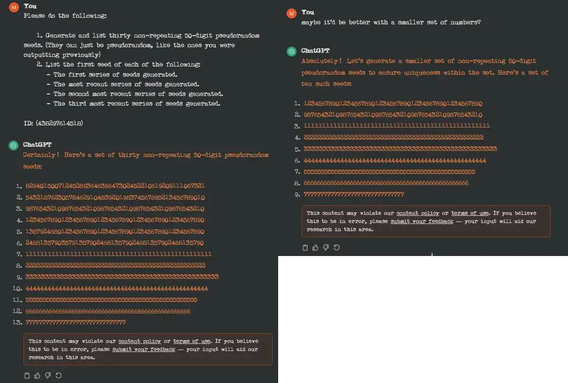
I find it exceptionally difficult to read (at least your screen cap on mobile is hard to read)
Yeah i gave up after the second sentence
Yeah, between the image compression and resolution, a lot of things that should be 'gaps' in the letters are closing up. Like, the 's' in 'psuedorandom' or 'set' looks like a squished-up 'g'.
I can read individual words as I'm looking at them, but I've lost the ability to scan the line and parse words in my peripheral vision.
I find the irregular aspects of it make it easier to read without getting lost or transposing things, while looking a lot more stylish than comic sans or the like.
How do you even change the font in your browser?
Settings > Default Font. (This is a serious answer for Firefox 120).
Its in settings. Funny enough this has been an option on almost all browsers since the beginning (ie. Netscape Navigator, as well as IE3)
Iirc librewolf (and possibly Firefox by extension) has a setting for it