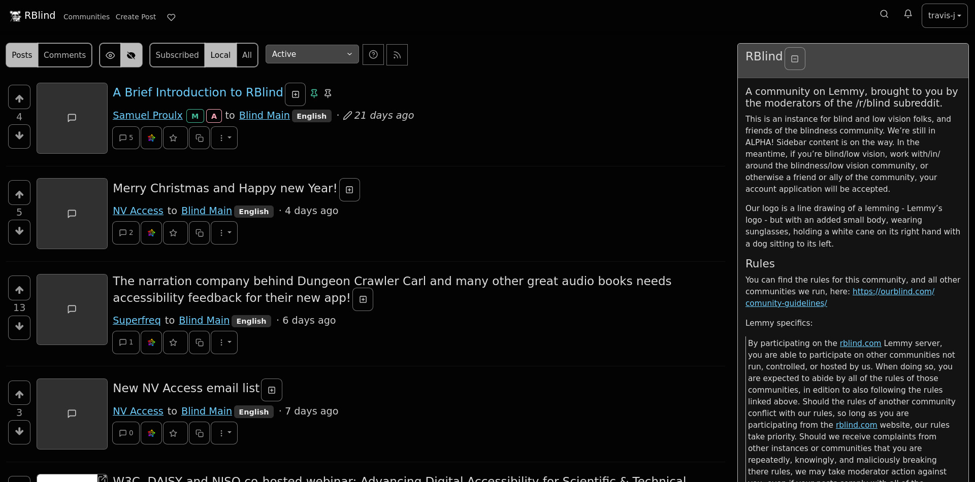
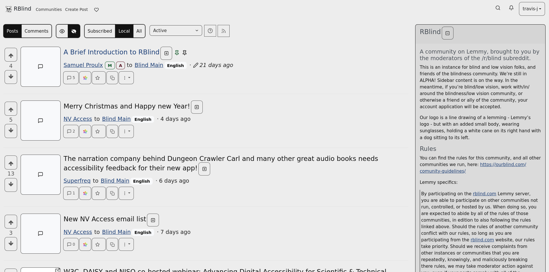
I’ve been using the RBlind-Dark theme for internal testing for a few weeks and I’m super happy with it. It’s addressed a number of issues we had back in 2023 and just looks and feels nice. Beautiful design doesn’t have to be inaccessible!
Blind Main
The main community at rblind.com, for discussion of all things blindness.
You can find the rules for this community, and all other communities we run, here: https://ourblind.com/comunity-guidelines/ Lemmy specifics: By participating on the rblind.com Lemmy server, you are able to participate on other communities not run, controlled, or hosted by us. When doing so, you are expected to abide by all of the rules of those communities, in edition to also following the rules linked above. Should the rules of another community conflict with our rules, so long as you are participating from the rblind.com website, our rules take priority. Should we receive complaints from other instances or communities that you are repeatedly, knowingly, and maliciously breaking there rules, we may take moderator action against you, even if your posts comply with all of the rblind.com rules linked above.
Thanks for sharing! I crossposted your post on !fediverse@lemmy.world
Thanks for crossposting! The more widely we can get the theme known and used, the happier we are!
Happy to help!
Thank you! How do you like it?
I'm not using it myself, but it looks great!
Amazing initiative. Thank you for promoting accessibility!
Thank you, it’s all about doing what we can and working together!
As a sighted person, I would prefer the vertical colored lines that indicate the indentation of replies to be thicker by 5 times. As it is, replies appear to be very flat, rather than nested.
We appreciate the feedback! (Designer of the RBlind themes here).
We originally wanted to increase the thickness of the lines (and change the colour) of the post nesting next to comments, however these elements in particular are hard coded outside of all CSS themes and are inserted by some dynamic code that will "count" the number of comments in order to nest them correctly and add the style accordingly. So it is a limitation we cannot change (yet).
We've made a Github Issue about this, requesting for the lemmy-ui to define the thickness and colour inside CSS so theme developers can edit them: Define comment tree post left-border colour in CSS #2890 and Define comment tree post left-border width in CSS #2889. Once lemmy-ui address this issue we will be able to style the comment nesting border differently.
I would personally really like to change this as in web design it is best practice to separate style from function and for the most part the Lemmy CSS themes do this, but this is one area where they don't.
Thank you for explaining this, I was having trouble with this but I couldn't explain it well. With my worst eye I can't even see the lines and with my better eye I can just barely see them. Some would just say well, of course, use the better eye. Sometimes I don't have the option.
I. Love. Love. Love. This.
Thank you.
The inaccessible theme for Lemmy was more than half the reason I stayed on Old Reddit and rarely visited here and never explored Lemmy as a whole.
First impressions. I when I followed the link to Lemmy from Reddit I was using Kiwi Browser on a 2022 Samsung S6 Lite. Many of the page's buttons and menus did not show. I had to turn on Talkback to find the hamburger menu and log in. I guess the items were appearing black on the black background. Voting buttons were among some of the other items that did not show. I turned off some extentions and settings and it didn't seem to help. These kinds of issues were very common with dark themes in the past.
Anyway, I moved over to Brave browser and everything appears as it should. I have like 6 browsers because some websites appear better in one verses the other or ad-blocking works differently so it's something I am used to and don't mind. Just mentioning it here in case others are having difficulties.
I love what's here. The text is responsive to sizing and pinch zooming. There isn't any funny business like with sh.reddit, where the text gets smaller and smaller and smaller, as comments are added.
I struggle with seeing the new and the unfamilar so I am trying to push past that and know those things will get better with more use.
What I don't see happening is me adjusting to the color palette. In light theme I can't see a difference between the red and green used for admin and moderator, and I can just barely see a difference between the blue and the black and that's not an immediate thing, it's an if I stare at it long enough I am pretty sure it's two different colors. The purple is fine but if you knew me, you'd know that isn't a surprise.
The colors in dark theme are more different. There's an obvious blue and gray (which is shocking if you knew me, haha) and the admin and moderator are different colors. One is pink and I am guessing the other is a green but it's not obviously a green. Just different from the rest. It's a weird color that I would say I don't know what it is and would be laughed out of the room by most people. But I am not a fan of pastels. I am better with vivid colors like neons or bold primary ones. I typically use blacks and yellows and oranges and purples. But I understand not everyone is me.
In light theme the comment tree lines and dividers are not good. The dividers are not visible to me and the vertical comment lines are not great. None of it stands out.
I need to spend more time withe dark theme to comment on the these lines.
I appreciate that there is space between the up vote and down vote, but I feel like there needs to be space between down vote and view source.
The vote counter and the time stamp feel like they should just be on a different line right now they're weirdly messy and broken up depending on username length.
My only other comment is about the text field I am currently writing this in, every once in a while it does a weird auto scroll thing that is too fast and it screws with my vision. I can't really explain it better.
Anyway, even with the things I pointed out, I still find this amazing and fantastic. I am thrilled to bits.
Hello, RBlind Lemmy theme designer here - we appreciate the feedback!
At least in terms of post nesting, I made another comment about this but the short of it is that our ability to change it is limited right now because the values relating to the width and colour of the left border is not defined in the CSS: Lemmy RBlind Post about Comment Nesting Styles
You make some good points about the dividers and distinguishing comments being different for the Light and Dark theme. We can look into if things like the comment fields can be made larger, as well. This theme is still in alpha so we appreciate all the feedback we can get at this stage.
If you’re using this site and have low vision, colorblindness, a cognitive or a motor disability, consider providing feedback. Do they work well given your needs and use case?
I just noticed this part of the comment and saw nothing about this in the annoymous survey.
Speaking for myself as a person with cerebral palsy, I am not noticing too much issue with my mobility impacting use. Buttons are large and easy to tap. The outlines help, too. I use assitant menu on my Samsung tablet and it seems okay for now. In the next few days I'll poke around with Voice Access and more in depth use of the assistant menu.
I switched over to dark menu to make these comments and I don't feel better or worse about page breaks and the comment tree colors.
I just noticed OP doesn't have a special color designation.
You’re right, while our efforts target different groups, the survey was particularly focused on vision.
I’m really glad it’s working for you!
I’m not sure what you mean about OP color. It’s the same blue as links, no?
So, just a noted, I used Voice Access to navigate the page and I feel everything was highly successful except, navigating some links. I think the problem was confusion with Rblind and Ourblind and the way cerebral plasy affects my voice. When I switched to grid labeling it was mostly successful, too.
Overall, the advanced features of the Samsung Accessibility Assistant menu performed exactly as I expected which was poorly. Obviously, that's an issue with Samsung and not rBlind.
So good on y'all for doing so well!
What I mean with OP color, is that there's no difference between the blue color of your name, and the blue color of my name. In reddit, you as OP would have a different color than me a commenter.
It's fine as is, it's just different than reddit. It's like when admin are distinguished red or mods green OP or [S] gets to stand out from the regular comments.
I see you have OP and that's good, it just literally gets lost in the crowd of clutter to me without a color change.
Oh, yeah, it’s a little different.

