this post was submitted on 31 Oct 2024
29 points (93.9% liked)

homeassistant

12129 readers
12 users here now

Home Assistant is open source home automation that puts local control and privacy first. Powered by a worldwide community of tinkerers and DIY enthusiasts. Perfect to run on a Raspberry Pi or a local server. Available for free at home-assistant.io

founded 2 years ago
MODERATORS
 

Hello everyone,

Haven't deal with my dashboard for a long time so want to take advantage of some recent features like visibility condition (not sure that's proper wording) to create a new clean adaptive phone and tablet dashboard, but missing inspiration so curious how yours looks like. How did you organised it? which card (also card combination) is your favourite?

top 15 comments
sorted by: hot top controversial new old
[–] ryantown@lemmy.world 3 points 3 weeks ago (3 children)

Here's mine. It's almost completely stock – no custom cards or YAML configs. I wanted to keep it super easy to maintain.

It uses most if not all of the recent dashboard updates.

This view is meant to be a dashboard of quick access to frequently used functions for my whole apartment and then the other tabs at the top are to drill into specific rooms.

The top two sections, "Media" and "Lights" hide when I'm not home. "Media" also has cards that appear if I'm watching TV or listening to music.

The "Activity" section at the bottom is new and something I'm playing with: it's supposed to be an easy "floorplan" to show which areas are occupied.
[–] paf@jlai.lu 2 points 3 weeks ago

Thanks for sharing

[–] ryantown@lemmy.world 2 points 3 weeks ago

Oh and duh: the most important part is the theme "Metrology" by Madelena (who now works at NabuCasa).

https://github.com/Madelena/Metrology-for-Hass

[–] peregus@lemmy.world 2 points 3 weeks ago (2 children)

Cool! Which automation hides/shows them based on location?

[–] barcaxavi@lemmy.world 3 points 3 weeks ago (1 children)

I believe playing with visibility would be the easiest way

[–] peregus@lemmy.world 3 points 3 weeks ago

Right, thanks!

[–] ryantown@lemmy.world 1 points 3 weeks ago

Yep, just like @barcaxavi said. You can tie the section's visibility to your home zone and then if you have the mobile app set up on your phone, it's super easy to get a count of how many people are there.

[–] 4lan@lemmy.world 3 points 3 weeks ago* (last edited 3 weeks ago) (1 children)

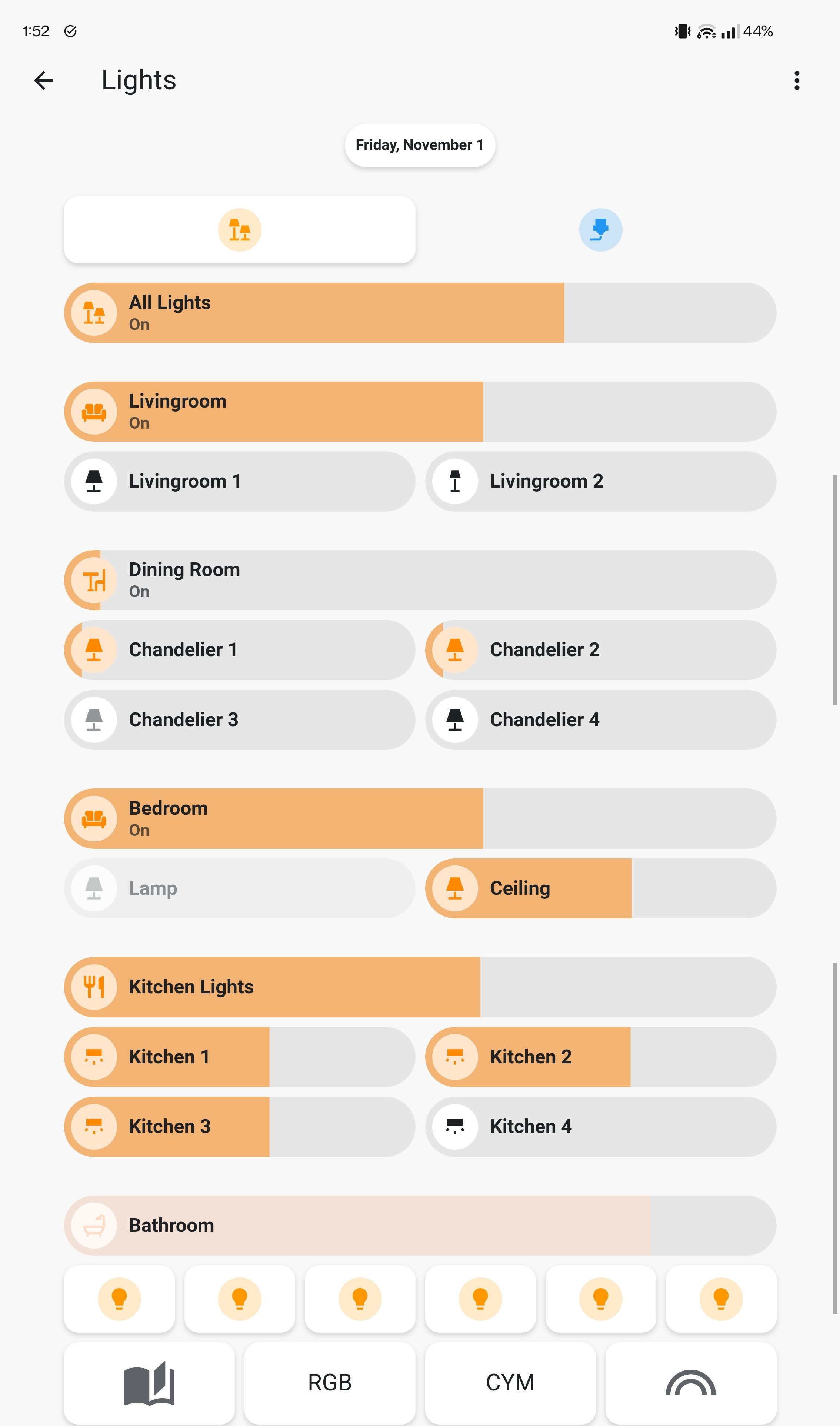
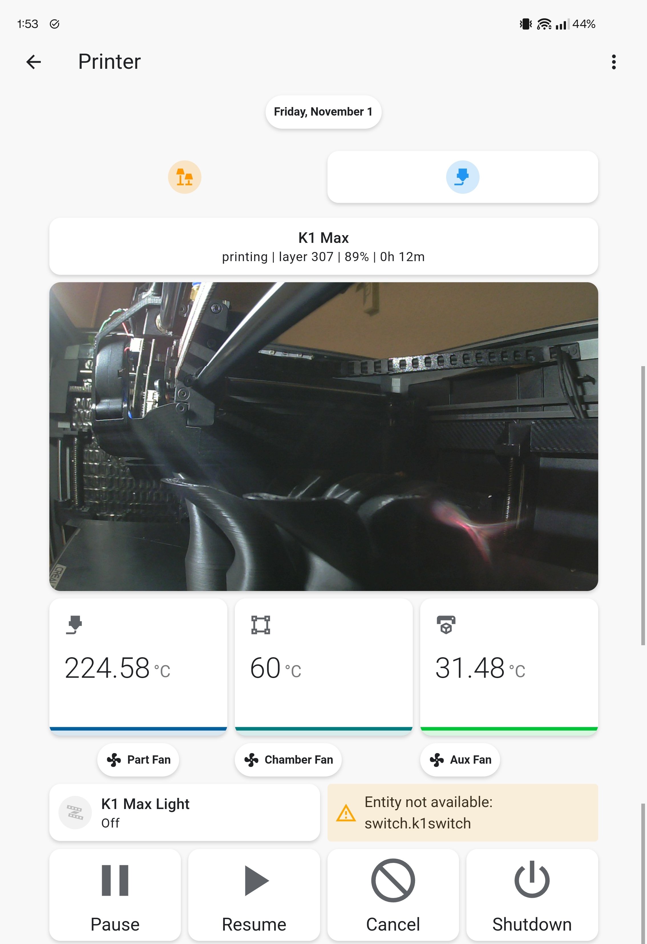
I split mine up into pages with buttons at the top

[–] paf@jlai.lu 2 points 3 weeks ago

Nice, that's remind me that I have also a printer card/page to create

[–] atek@lemm.ee 2 points 3 weeks ago (1 children)

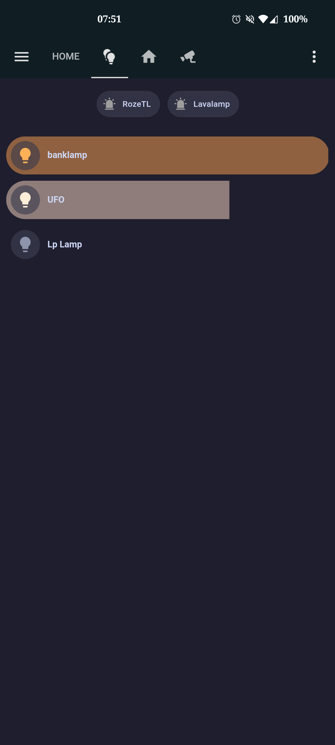
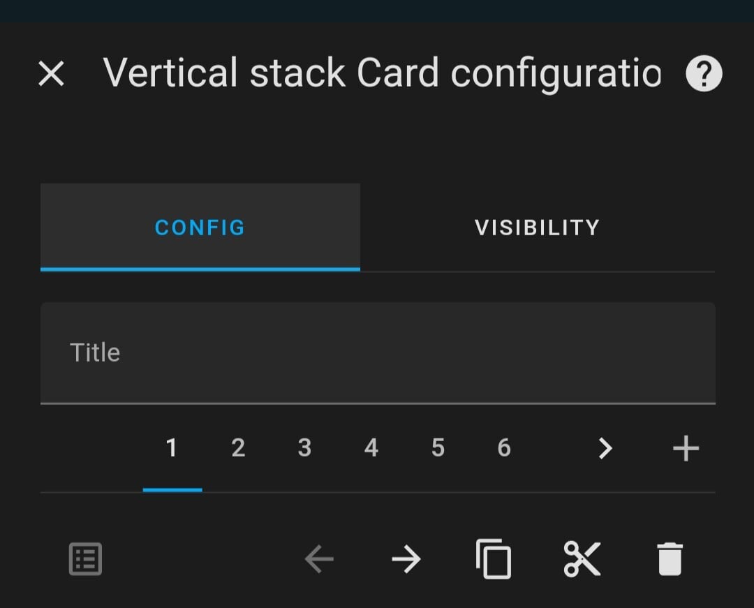
I started using bubble cards in vertical stacks, alongside the catppuccin theme.

[–] paf@jlai.lu 2 points 3 weeks ago

I have forgotten about bubble card, thanks. Started a test with a vertical stack then insert horizontal stack. I've tried with mushroom card but might replace those with bubble card

[–] Tzig@sh.itjust.works 2 points 3 weeks ago* (last edited 3 weeks ago) (1 children)

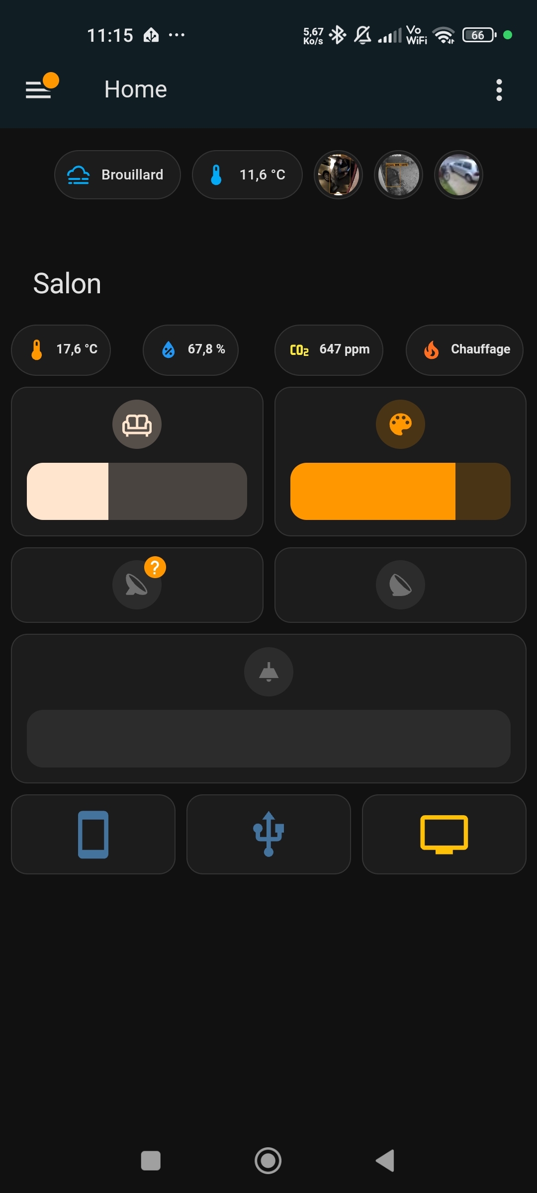
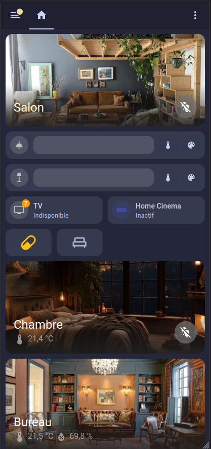
Here's mine, using a fair share of Mushroom for the light buttons, the "Room" tiles are actually pretty great!

[–] paf@jlai.lu 2 points 3 weeks ago

Ça rend bien, merci

[–] GreatAlbatross@feddit.uk 2 points 3 weeks ago (1 children)

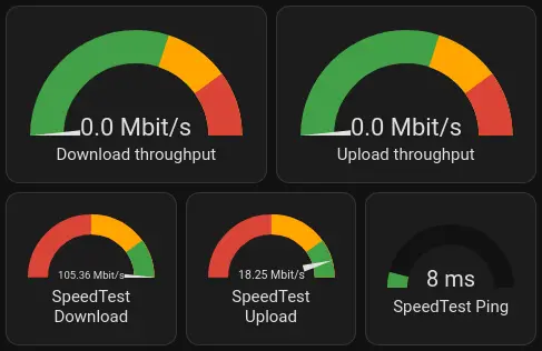
I'll just re-share mine from last time.
I tend to use the Horizontal Stack. On a mobile device, I just get one stack per line.
And on bigger screens, I get multiple stacks to make use of space.

General "Going out" page:

Internet speedtest page:

[–] paf@jlai.lu 1 points 3 weeks ago