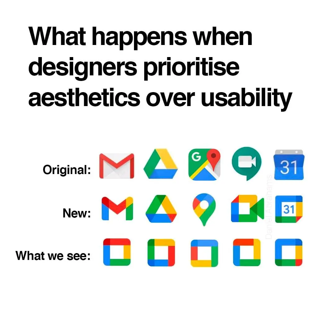
There's always a yoyo effect with design. I fully expect Google to swing back to gothic palette and highly detailed icon within the next decade.
Memes
Rules:
- Be civil and nice.
- Try not to excessively repost, as a rule of thumb, wait at least 2 months to do it if you have to.
I don't love the difficulty of extremely fast individual identification but there is something to be said for the ease of extremely fast collective identification, it makes it very easy to see which group of apps each app belongs to, which is also valuable.
Except this is not "browsers" group or "email clients" group, this is "vertical monopoly" group.
On top of that in Play store lots of times when I search for certain app it gives me like 10 more alternatives that all have slightly different logo but all use that same yellow-green-blue-red color palette that google has, so with all these copycats it's even harder to figure out whether app is from google or not
Remember way back when, when you could set icons to be whatever you want?
oh yeah, everything is a pirate ship!
I think the maps actually looks more distinctive because of the shape. The rest are worse to differentiate though.
I actually think these are fine. If I can quickly recognise each on my homescreen (I don't use labels) then it's fine, and I've never had a problem with any of these.
I like it because each company each has its own set of apps, and they have somewhat unified app icons.
Proton is the same, which similar icons as google but with their own unified branding.
I like it, personally.
Anyone else this there's actually nothing at all wrong with the "New" row of icons? Except for the triangle one, which is terrible in its "Original" version as well, as it indicates absolutely nothing about its app (I believe it's Google Drive, right?). All the rest are clearly distinguishable, and have relevance to what the app does.
The Google drive logo is even worse when you compare it to the play store logo which is also a triangle. I mix them up all the time
I’m mad that the Gmail icon is no longer an envelope, but other than that they’re fine.
Since Gmail doesn't have the obvoious envelope anymore I often open it when I want to open Maps. My brain ist like "M for Maps".
What I keep seeing: $ $ $ $ $
Color is the first thing the eyes tend to notice, then shape, then lines and details. The new icons all look the same at the edge of my vision, I have to look at them straight on to distinguish them. Individually each one is fine but together, like what the hell?
I don't rawdog Google icons anymore anyway, I use an icon pack
To be honest the maps and the meets icons look better
