It's not even more aesthetic. Just more unified in branding.
It's not even more aesthetic. Just more unified in branding.
I think what really bothers me about the aesthetics is that the shapes are broken up by the coloration. For example, the pin icon for Google Maps looks almost like a hook, because the yellow has little contrast on this white background.
Whatever. It sucks ass is the point.
My point is that it's also ugly.
And the interface of their apps are still incoherent af. I don't know how, but they manage to make things worse every time
It's ok, they'll just retire the service eventually.
Yeah, the old logos were all over the place. At first glance it’s not obvious they’re all Google apps.
To me, that's just the case for camera and calendar. Maps is IMHO perfect (except the unnecessary G) and the red-and-white envelope is quite well-known.
And? All of those being part of the same walled garden is a bug in the legal system not a feature.
Better be explicit about the walled garden rather than being diffuse about it
i think they did need to unify the design and branding but i also agree they went too far with it. if they had only chosen 1-2 colors for each app icon that would have helped a lot.
gmail - red
drive - yellow
maps - green
meet - blue
calendar - lighter blue
problem solved
Problem solved! If we ignore the world's ~300 million colorblind people.
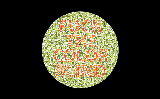
is that the one that says "fuck the color blind" because if so hey!! that's not nice
Most software pretty much doesn’t give a fuck about the visually impaired despite everyone talking big shit about accessibility. So I could certainly give a fuck what color someone’s logo is.
i think they forgot to mention: they're not all the same shape.
True. Colorblind people come in all shapes and sizes.
Ah, the old Lemmy shapearoo
Worked for a few jumps but then it sent me to kbin with a 50x error 🤷
Edited my comment with a different link, should be a bit longer now
Hold my shape, I'm going in!
I'll hold your shape. 😏
I'll keep using my favorite icon pack instead, thank you very much
which do you use ? i am looking for a good one
Poppin, Olympia, Cyber, Minima and/or Outline, depending on the mood, season and launcher. There isn't much left on factory spec with my phone.
People simultaneously justifying their jobs but not willing to make significant, meaningful changes
I like the new version of the last two, but old for the rest
The camera app and spreadsheet app? Because that's what i would've guessed they were based on the icons
those are Meet and Calendar.
What do you mean, the new ones are still different shapes.
What's three font used in the heading? Is it some flavour of Helvetica?
It certainly looks a lot like Helvetica. Probably could be any of these Helvetica clones:

I will also say that it feels a lot like Inter to me, which it's not as the i-dots aren't round, but maybe you'll enjoy that one anyways...
My wife really really really wanted a MacBook in 2020 and the major plus is of having it is that I got to steal all the fonts. Mostly, I just wanted Helvetica lol
It does not seem to have consistent kerning.
Man... I might be showing my age, but checking out some of the links in these replies gave me nostalgia for the website FontsnThings.com (or was it "FontsandThings"?). I used to love browsing that shit as a kid and downloading all the coolest looking fonts lol
Anyone else?
Plus the art they started using in gdrive. The art on its own is cool but within the Google ecosystem just feels like… what is it even… why… ugh I hate it.

I am actually quite fond of this style, though this might be controversial
prevent body shaming by only showing obese/disfigured people so society accepts it as a healthy norm
Corporate Memphis. It's an art style a lot of people hate, and I can understand why.
soulless corps trying to seem friendly, that's why
i see the new icons wanna intergrate googles colors ngl
I wouldn't even call this "aesthetics". Rather "conceptual homogeneity" or something like that. It's what happens when you strive for a uniform look over a useful or visually pleasing one.
Not Google related, but whoever decide that the best color scheme for an Office suite should be light grey text on a white background deserves to be flogged.