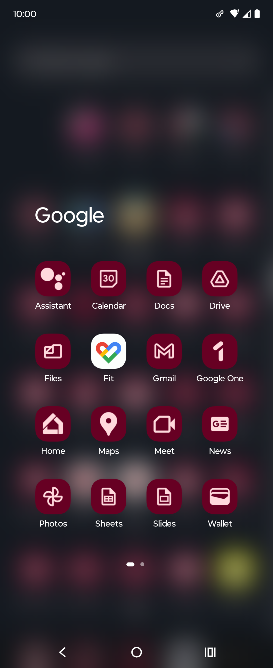
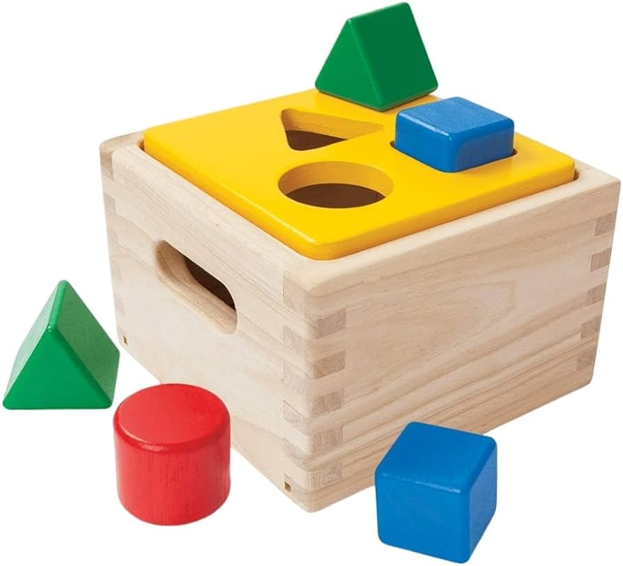
I feel like it's easier to use the monochrome mode of the phone than these icons
Memes
Rules:
- Be civil and nice.
- Try not to excessively repost, as a rule of thumb, wait at least 2 months to do it if you have to.
In case you want to feel old, this change happened almost 10 years ago now fellow grandpas.
Its one of those things u never think about as a person without disabilities, cuz i can tell the difference just fine, i guess they should have consulted someone with a vision impairment when considering stuff like this.
The homogenization of these icons has been a long source of consternation for me.
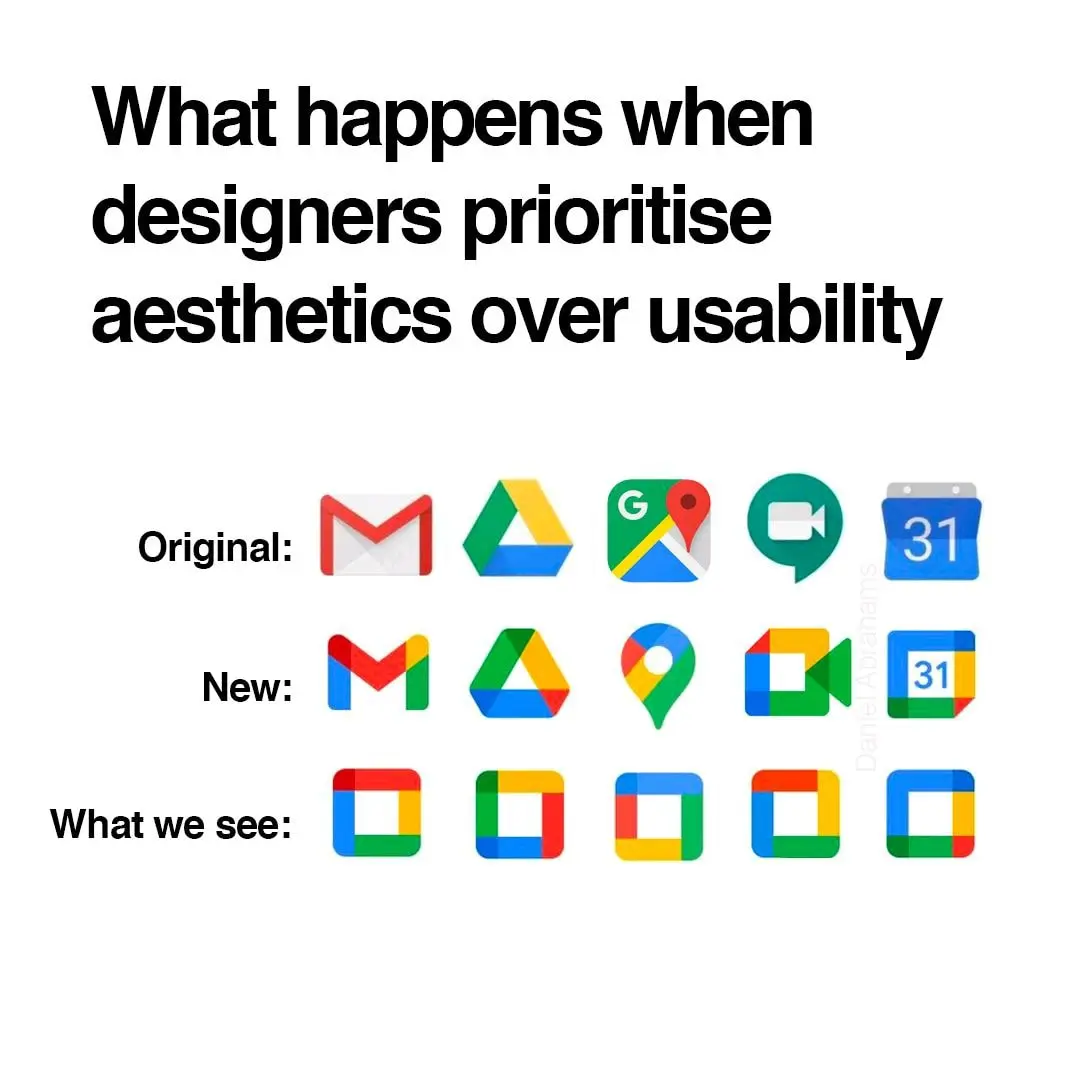
They're barely functional as icons; you can scroll right by them and miss them; which makes finding the apps in a list of apps a bit annoying sometimes. Removing each icon's unique color scheme and replacing it with the 'company 4 colors' was the stupidest fucking idea ever.
Even more infuriating is how they keep renaming the applications to unexpected things every so often; so they move around; and it's dreadfully annoying to remember if they prefixed the name of the app with a G or something else completely different, which renders strict alphabetical sorting a bit moot.
Just had to comment on your elegance and class good sir. Carry on!
It can get even worse. My phone lets me do this to my icons which is ridiculous. I think this was opt-in but now that I'm going through my settings again I can't actually figure out how to turn it off lol

God I miss the original Material Design
I filed a very irritated Radar / Feedback (Apple's terms for bug reports) with Apple when the icons for apps all turned to rounded squares. I compared them to Google's icons and challenged them on making everything harder to distinguish.
I hate contemporary GUI design. Not all of it, but probably half.
For mostly all of my app-launching things I always prefer searching for text than searching for an icon. In pixel launcher, I always use the app drawer search, but an even better solution is in something like Niagara launcher.
The absolute worst is the idiotic "let's make all app icons the same shape" thing.
oh noooo icons sharing a common design language and color scheme? the absolute horror.
if you can't tell the difference between these icons i have a great educational resource for you

nah I still recognized all of them as google products bc they use the same 4 colors, but in different interesting ways. gmail was all red but a letter shape. Maps was a red pinhead. drive was a triangle but used all the colors but red. Calendar was a less noticeable shape but instantly recognizeable as a tabletop day calendar. now everything has to use all 4 colors and the shapes are so small that the colors can't do enough on a phone screen to differentiate themselves.
They already had a common design language and color scheme. Now they have a samey-ness to them that takes away visual interest.
Try harder, you can do better than this.
I keep all my Google icons quarantined in one folder. Case in point:

Ugh… feels dirty to even have most of those apps installed.
Of those I have Gmail, Translate, and YouTube. I would get rid of those if got decent iOS alternatives.
I use nova launcher. It allows you to replace any app icon by any png file. So you can download the old icons from the internet and use them on your phone. It's a lot of work and I agree Google shouldn't have done this, but at least you can revert it if you want to put in the effort.
I also use Nova Launcher and had no idea you could do that! Thanks for letting me know.
I was yelling about how windows 11 swapped out text listingzs for copy, paste, etc from its contextual menus for stupid icons just the other day. Modern UIs are becoming so “streamlined” to the point of uselessness.
What would happen if people deserted Google products in droves?
Mail:
- Vivaldi mail
- Android clients: K-9 Mail
- Desktop client: Betterbird
Cloud:
- Mega [referral URL]
Maps:
Meet:
Calendar:
- Vivaldi calendar, syncable with a myriad of clients.
Here's an exhaustive list of Mostly excellent “free” software that I use.
Please also consider supporting the myriad of developers who offer their superior products for free, open source, without ads.
“What if I paid for all my free software?
I've always felt guilty by taking for granted the rare breed of virtuous humans that provide free excellent software without relying on advertising. Let's change that and pay, how much would I “lose” anyway?” —https://www.cynicusrex.com/file/takemymoney.html
Not a fan of Vivaldi, but that's the spirit.
Uh, are you geometrically dyslexic?
Yeah these icons are all distinctive
Oh yeah it's easy to confuse an envelope for a bulbous pin if they're the same color. I nearly mailed a letter in a turkey baster the other day so I get it
Yeah this is the worst! You know a few designers raised this exact problem during review, too, and were shut down
Hey show some respect! A whole team of people each racked up tens of thousands of dollars of student loanb debt and spent months tweaking their designs, just for upper management to wreck it all on a whim in order to get you those new icons.
Triumph of visual design over interactive design. These days, most “designers” only care about graphics visually. The much deeper science of how people use and understand things is beyond them. Worse, they think the problem is that everybody else does not “get” visual design.
Style over substance.
I use an icon pack on Android to revert them to their previous icon, the new ones are indeed terrible..
What I see:
💩 💩 💩 💩 💩
Custom icon packs for the win!

