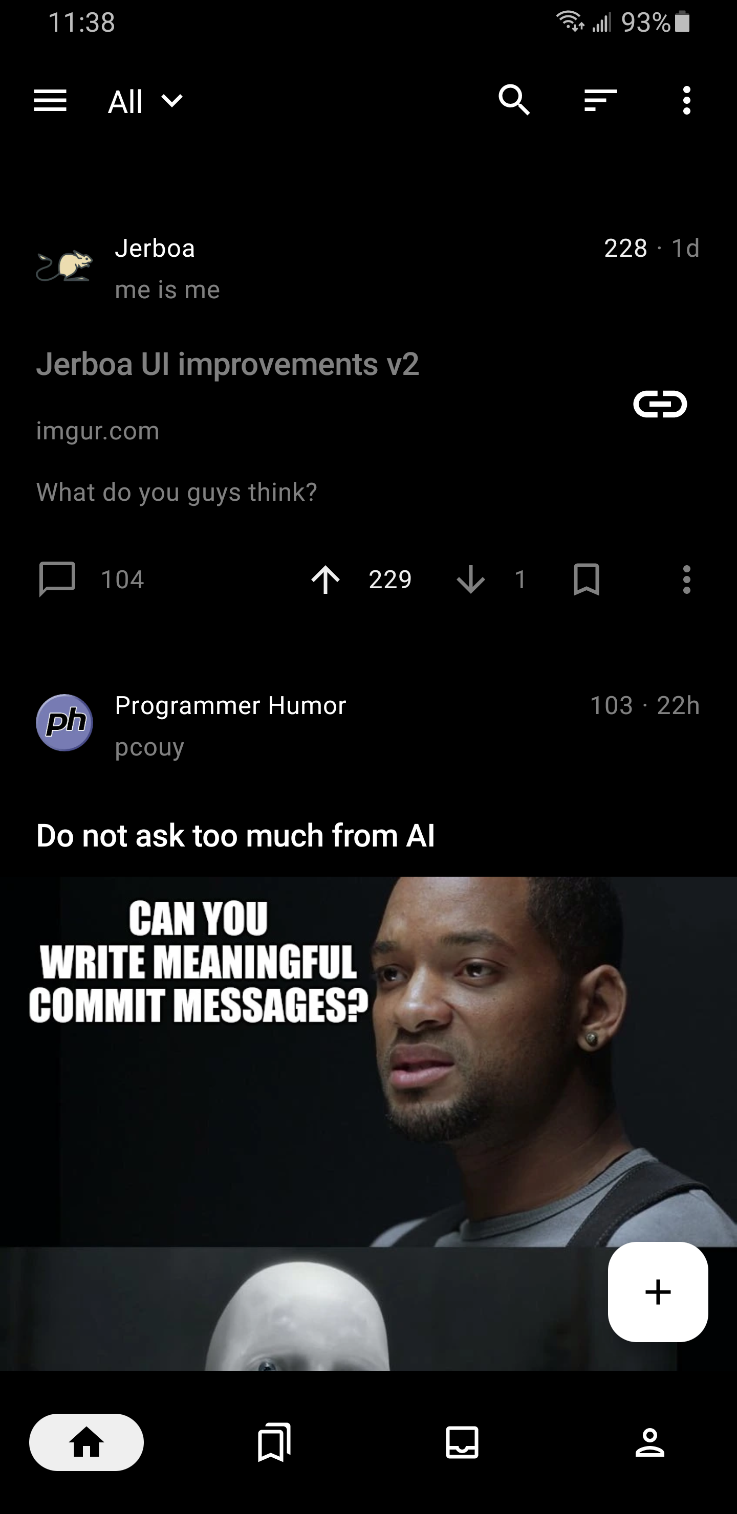
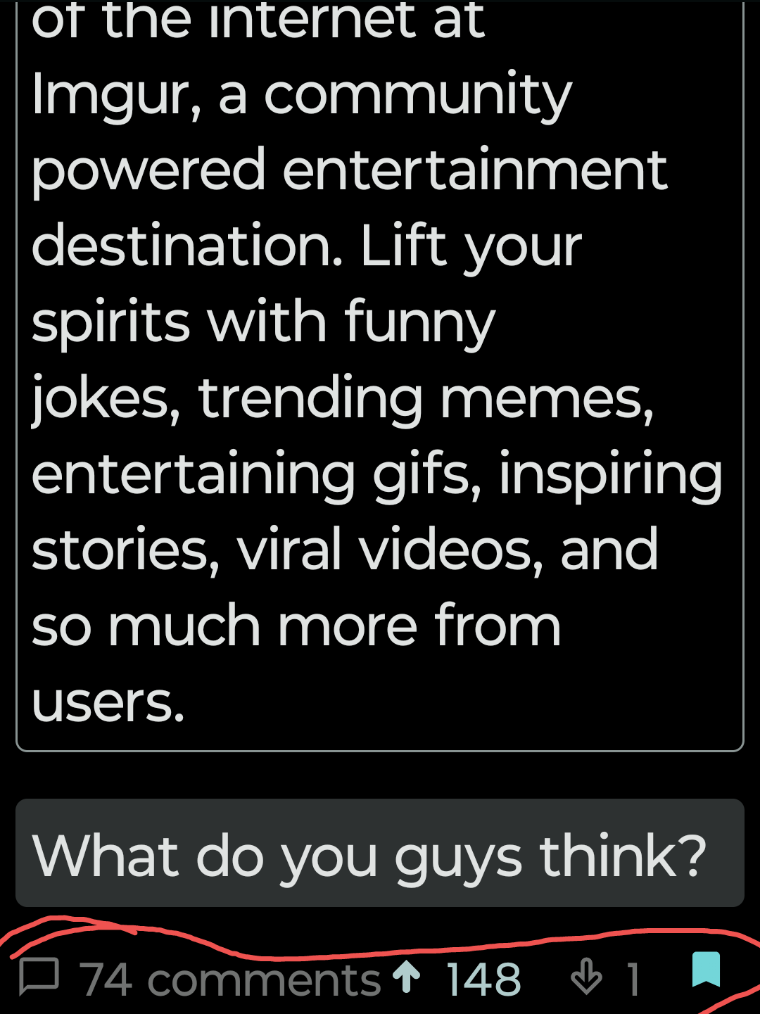
Someone's been looking at Sync for Reddit to get some good ideas 😁
This is how I will end up staying at Lemmy
Jerboa is a native-android client for Lemmy, built using the native android framework, Jetpack Compose.
Warning: You can submit issues, but between Lemmy and lemmy-ui, I probably won't have too much time to work on them. Learn jetpack compose like I did if you want to help make this app better.
Jerboa is made by Lemmy's developers, and is free, open-source software, meaning no advertising, monetizing, or venture capital, ever. Your donations directly support full-time development of the project.
1Hefs7miXS5ff5Ck5xvmjKjXf5242KzRtK0x400c96c96acbC6E7B3B43B1dc1BB446540a88A0141taVyY6e1xApqKyMVDRVxJ76sPkfZhALLTjRvVKpaAh2pBd4wv9RgYj1tSPrx8wc6iE1uWUfjtQdTmTy2FGMeChGVKPQuVaddr1q858t89l2ym6xmrugjs0af9cslfwvnvsh2xxp6x4dcez7pf5tushkp4wl7zxfhm2djp6gq60dk4cmc7seaza5p3slx0sakjutmSomeone's been looking at Sync for Reddit to get some good ideas 😁
This is how I will end up staying at Lemmy
The creator of sync said that he's considering adapting the app to use Lemmy. Fingers crossed.
That would be huge for lemmy if the 3rd party reddit apps tried to adapt to lemmy.
I'm going to miss sync. I bought pro in January of 2014.
Now that's sexy. Made me forget about the porn subreddits that I left behind
It's terrific! Tried it last week but decided to just use the Lemmy website on my phone instead. Now I'm back to Jeroba as my daily driver. Update is excellent. Thank you!
I still haven't added my changes to Jerboa yet (I'm a third party), glad Jerboa is improving though.
IDK if this is possible, but can the downvote button be removed or hidden if I'm part of a community that disables downvotes? I'm afraid that every time I misclick it the admins are gonna boot me for being a negative nancy.
This was fixed in this PR: https://github.com/dessalines/jerboa/issues/390, it should be available in the next app update
I think that setting works on a per instance basis. No need to worry.
It would be nice to have the app highlight new comments when you come back to the post, like in Boost
Thanks for the update, can we get a feature to change default setting for home page like "Hot" instead of "Active" and "All" instead of "Local"?
Great work devs
Thank you :) I'm a third party but I'll try to get my changes added to the official app
I'd love an option to load top-level comments only by default.
nice, but looks too flat imo. I rather all black or have some more thickness.
I added a monochrome mode

It looks great, thank you very much for your work!
If you're looking for inspiration on UI design, you might check out Sync for Reddit while it's still active. It's one of the best apps I've ever used.
Relay also has excellent UI. I tried pretty much every Reddit app available on Android and kept coming back to Relay.
The ability to swipe away posts, or collapse out all the 'read' posts was awesome for browsing
+1 for Relay. Great UX
Yup only Reddit app I've consistently used for years. None of the others were quite the same
Awesome work! I do Ui/UX for work a ton, do you have open pull requests on gh?
Yes they do.
I have already contributed to the documentation of backend and it has been approved and merged.
wow! that looks really nice! thanks
can i please filter out image posts i think memes are extremely annoying
The fact that Jerboa makes me click an Imgur link rather than embedding the Imgur content under this post when I click it feels like a possible area for improvement.
Jerboa could definitely benefit from an in-app browser so images and links don't push to other apps.
In the meantime, you could use ImgurViewer. Setting it as a default app makes it work pretty seamlessly.
edit: didn't realise I'd linked the Spanish page, oops lol
Thank you so much for this!
Just a note to say thanks for your hard work on making Jerboa, really enjoying using it.
I don't think I'd be able to figure out Lemmy without it
I feel stupid. I can't for the life of me figue out how to reply to replies. (Edit: reply to replies in the inbox, it's not changed in the wild)
Other than that, everything looks good 👍
Edit³: issue closed, I would ask for more clear indication of the feature than (i think this is it) "comment action bar interaction improvements". I know the changelog needs to be succinct and must avoid excessive verbosity, but it took a while to figure out that long pressing in the username/vote counter bar reveals the interactions. Also an option to have them revealed at all times would be appreciated.
This is amazing!
Looks good!
One suggestion:
Can you make an option to hide the controls for comments (up/downvote, permalink and so on...) and make them only pop up when I press on the comment?
When reading the comments of a post, the controls take away a lot of screen space. I don't want to interact with very comment, so hiding the controls would declutter the comment section imho
Example of what I mean in Sync for reddit:
If you long tap the comment, it hides the buttons.
But I agree that it should be hidden by default. And swap the long tap and short tap behavior.
I have been enjoying this app and it's great to see even more improvements
Looks nice but I usually use the list view!
Looks awesome, but please add a separate setting to set the font size of the front page and the posts/comments.
The way it works currently, front page font becomes too small when changed in settings.
I'm loving the new AMOLED black!
There's a bug I'd like to make you guys aware of:
I could not reply to this post because the "comment icon" was missing. I had to turn my phone in landscape mode just to see it. I can see it on other comments without doing this though. Just not on the OP.

I discovered two different bugs, the inbox replies interactions are missing, and changing the font size cuts off the bottom option in settings.
I'm wondering if you could try changing your font size and see if that effects things for you?
I have the same problem with inbox replies. Worked yesterday. No way for me to reply now unless I hunt down the reply in the thread itself
It's not a bug, it's a feature! A poorly documented feature.... long press in the space between the username and the vote count/timestamp and it will expand the interaction bar.
Thank you so much for pointing this out. I should also start getting into reading the release notes so I know about these changes.
Another thing I want to ask the Jerboa team is if there is a way to search the community that you are in for posts that already exist. I don't want to make a feature request that has already been made.
Works really well. My only complaint is when trying to collapse a comment tree if I accidentally tap a user's name instead then swipe to go back all the comment trees I've collapsed are no longer collapsed.
[edit]
Replying to a comment also uncollapses all collapsed comments.
We'll likely add an option soon to turn off small links (like inline user names and community names) so you won't be taken to the user's profile in the first place if you accidentally tap it.