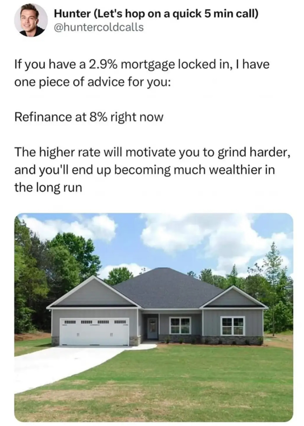
I gotta say that is one depressing looking house. It looks like a garage with a house attached to it rather than the other way round. And it's just so grey and featureless.
LinkedinLunatics
A place to post ridiculous posts from linkedIn.com
(Full transparency.. a mod for this sub happens to work there.. but that doesn't influence his moderation or laughter at a lot of posts.)
All the new houses going up around me look like that. Except for the ones that take up almost the entire lot so they can cram a 4,000sq ft house on a quarter acre.
Everything today is starting to suck because they're all min/maxing. Cars are all egg shaped SUVs or boxy trucks. Movies are all reboots, sequels, prequels, or live-action remakes. TV shows are epic fantasies or raunchy animated comedies or dark supernatural dramas. Because that's what all the metrics say will provide the best ROI.
I wish this Gilded Age were half as original as the last one.
Thank you for also noticing the shitty shape of cars. I guess there’s a demand there, but I hate it too. I constantly bring this up, so I’m happy someone else agrees lol
All. The. Cars. Look. The. Same. It. Is. Like. The. 1940s. Right. Now.
I’d love to see some sarcastic/ironic eye candy on this figurative and literal highway to hell.
This actually looks kind of quaint to me. Now the house would be on top of the garage and there would be six of them and the trees would be gone. I'd feel like a prince of the world if I had a 3% mortgage on this.
obvious satire is obvious
It's 100% a satire page.
The problem is WE CAN'T TELL.
Is that Poe's law in effect?
