this post was submitted on 30 Oct 2024
544 points (92.8% liked)
Technology
59566 readers
3220 users here now
This is a most excellent place for technology news and articles.
Our Rules
- Follow the lemmy.world rules.
- Only tech related content.
- Be excellent to each another!
- Mod approved content bots can post up to 10 articles per day.
- Threads asking for personal tech support may be deleted.
- Politics threads may be removed.
- No memes allowed as posts, OK to post as comments.
- Only approved bots from the list below, to ask if your bot can be added please contact us.
- Check for duplicates before posting, duplicates may be removed
Approved Bots
founded 1 year ago
MODERATORS
you are viewing a single comment's thread
view the rest of the comments
view the rest of the comments

You can accurately preach best usecases all you want it falls flat before peopled experience.
I always shutdown my desktop. So did i with all my previous desktops.
Ive always shut down every windows/linux laptop i ever had.
I shut down my android tablet after use.
I owned and mainly used a MacBook pro for 5 years, i never shut it down, i never shutdown my iPhone. It was also ironically the best windows laptop i had owned at that point (in dual boot) and i always shut down when i worked in Windows, just never in macos
Apple did not tell me to do this, it is not difficult to shutdown a mac, no one told me to change what i am used to. It just somehow made the most sense so thats how i used it. And i reverted naturally when i ent back to non apple desktops. I cant explain it better then that.
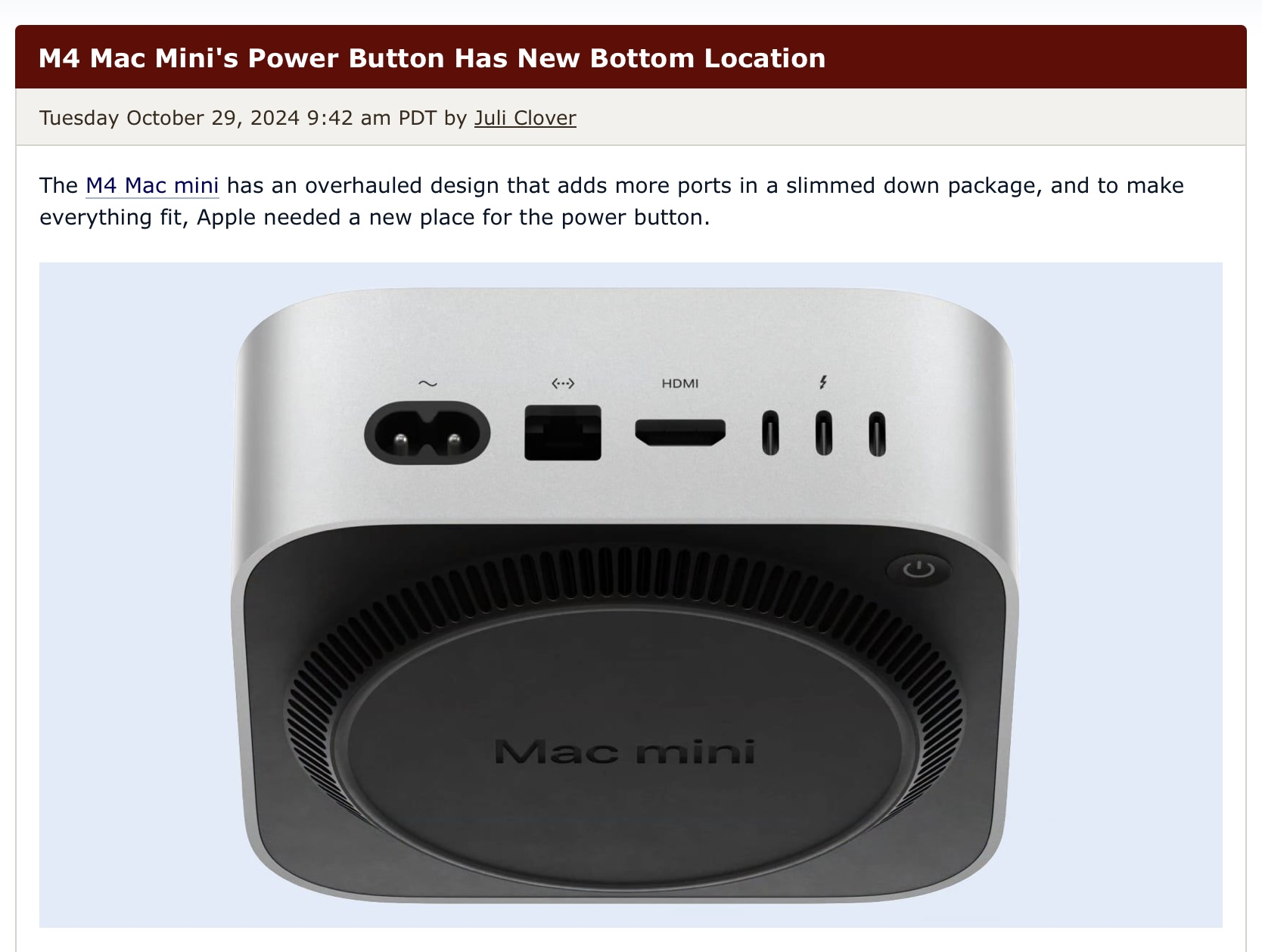
This does not excuse having a power button on the bottom, thats just ridiculous. Just a hint that what your saying about downsides is irrelevant to how people realistically use it.
Asking in earnest, but why is a power button on the bottom so egregious? I've owned various Macbooks over the last decade and I rarely use the power button - and when I do in recent years it's for TouchID. I leave my MBP open regularly, but have my battery settings set to automatically turn off the monitor and put the computer into sleep mode. I'm just not getting why it's such a big deal and it's mostly coming off as "grr apple bad, no like"
I recognize this may be a very autistic answer (i am)
The function of a button is to be pressed, to put functionality on the bottom of a stationary device feels incredibly wrong. Thats really all there is to it.
I can forgive a reset button being on the bottom because ideally they aren’t ever pressed and you definitely don't want them accidentally pressed. I recognize that for macos a restart is usually a reset troubleshooting step and i would be probably be fine with it the button was renamed with an explanation on its actual usecase scenario.
In any regards i feel like it makes much more sense on the back where the cables go in.
I have nothing against apple besides the general capitalist/consumerism stuff. I hate google and meta much more.